The Best Data Portfolios on the Web
By Andrea Yip on November 23, 2020
A portfolio is a tool for data professionals to use to share their perspective, tell their story, and most importantly, stand out of the crowd. A strong portfolio is concise, clear, and compelling. We recently talked about tips and a checklist of what should be in your personal portfolio in a recent Phase AI blog post.
Many of you asked for examples of stellar portfolios, so we searched the web and found diverse portfolios that demonstrate how folks have taken different approaches to showcasing their work.
Below are our favorites. We hope you take inspiration from their work!
Charlie Thompson
Charlie Thompson is a Data Scientist at Spotify who has previously worked in data roles at Booz Allen Hamilton, Storyblocks and at his own consulting firm, Thompson Analytics. Charlie features some amazing personal projects and thought pieces on his website. One blog favorite is an experiment where he adds GIFs to ggplots. He pulls this off using a dancing GIF of Thom Yorke, frontman of Radiohead, and adds this to a plot of album “danceability.” A key finding? Radiohead has gotten more danceable over time.
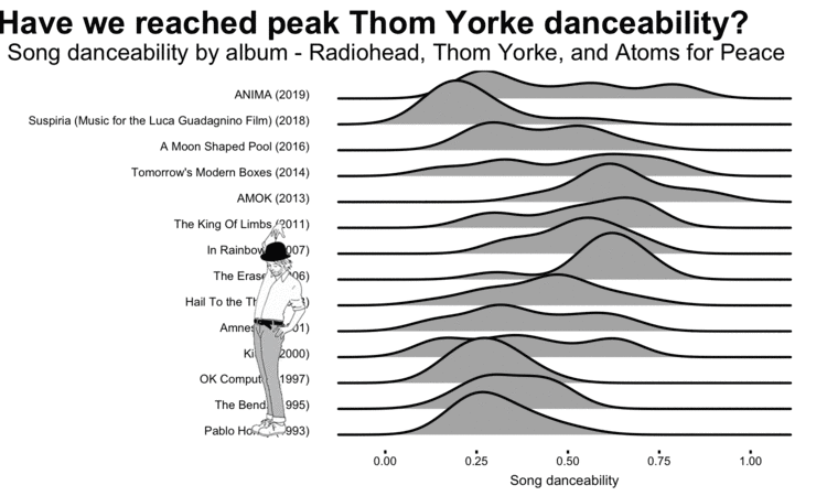
A GIF from Charlie’s blog post
Another great example is a portfolio piece called Sentify that analyzes music sentiment from your favorite artists on Spotify with R Shiny. I chose to test out Sentify with one of my favorite artists, Beyonce, and took a screenshot of the output:
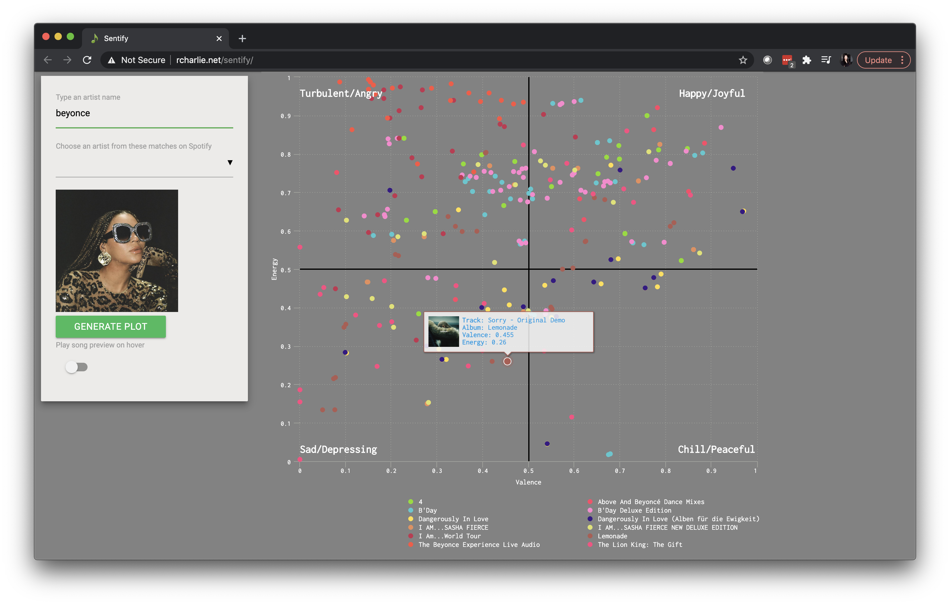
Looks like Queen Bey makes music that is more turbulent/angry and happy/joyful.
View Charlie's portfolio or LinkedIn.
David Venturi
David Venturi’s career has focused on the EdTech space, working at companies like Udacity, Class Central, and DataCamp. David has a great portfolio that highlights his blog posts, courses and projects he’s created at Data Camp, marketing videos, and personal projects. The site is clean, easy to navigate, and highly visual.
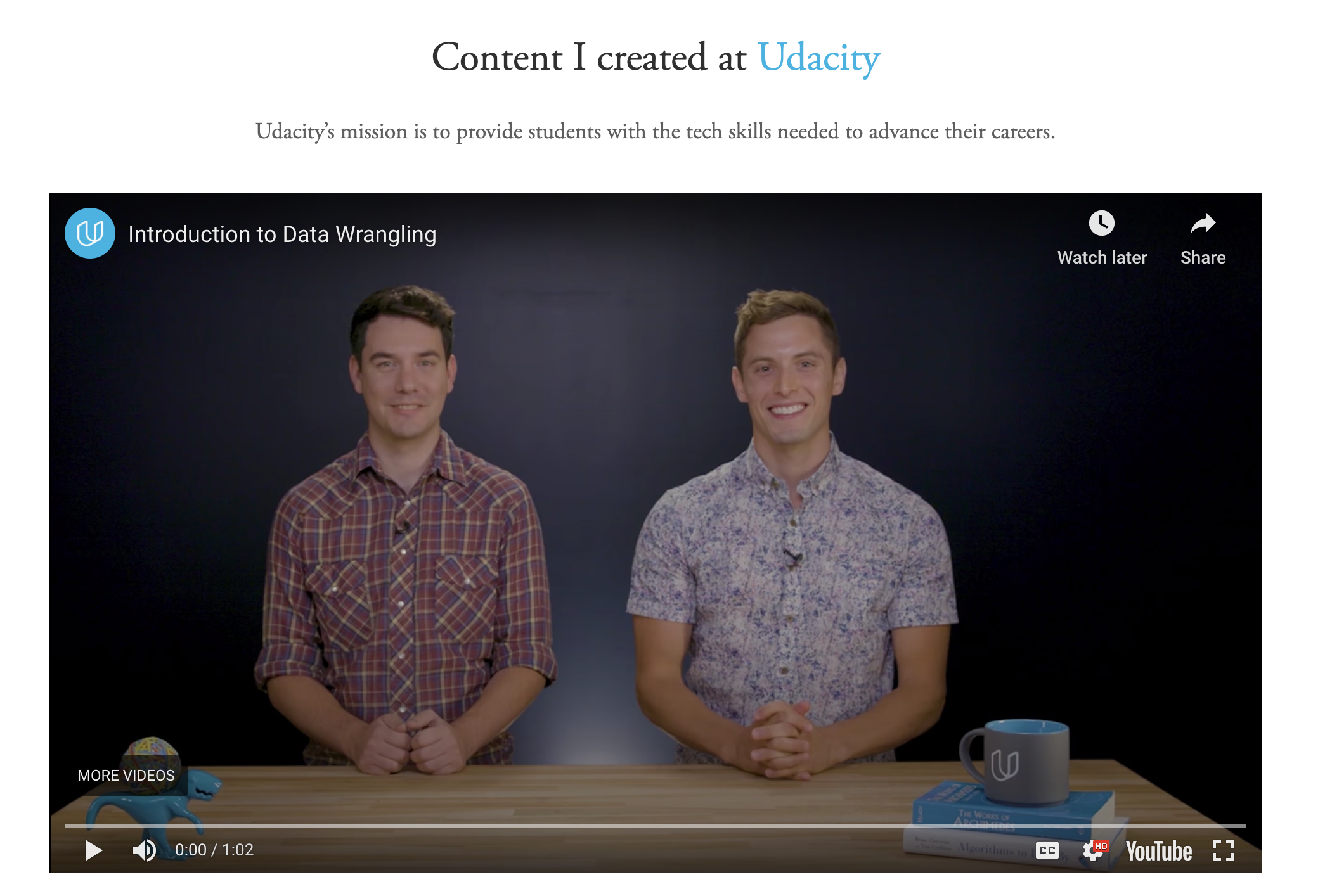
Screenshot from David Venturi’s portfolio
David showcases his personal work which includes a project called “Fresh Tomatoes,” a site that features clickable movie trailers and demonstrates Object Oriented Programming and the power of abstraction. He provides separate links to the code and the site.
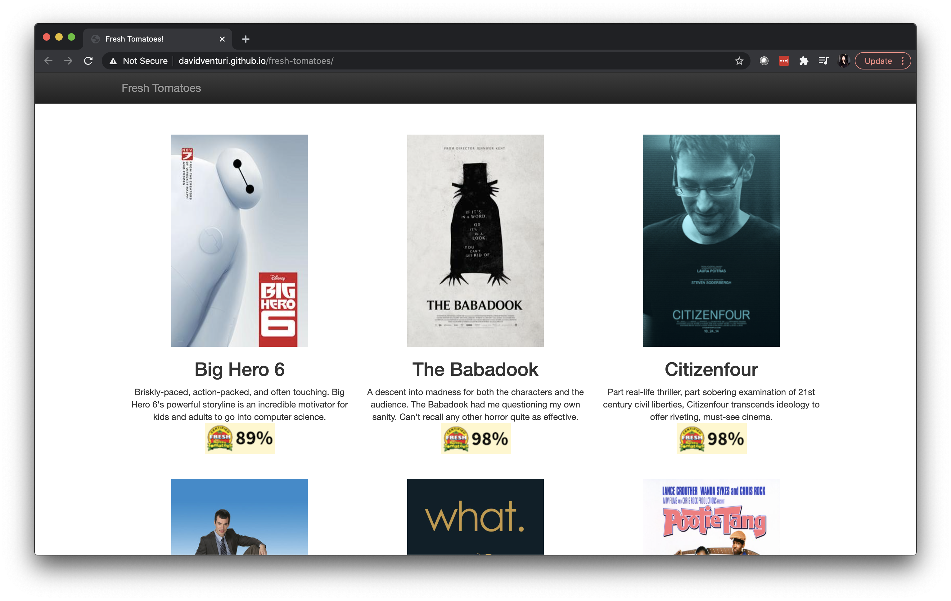
“Fresh Tomatoes” project by David Venturi
View David's portfolio or LinkedIn.
Brandon Kopp
Brandon is a research psychologist at the Bureau of Labor Statistics where he helps design and improve surveys. He is also a retired soldier in the Army National Guard. In his portfolio, Brandon does a great job of summarizing the key points of each project (see below), followed by a more detailed explanation of his work.
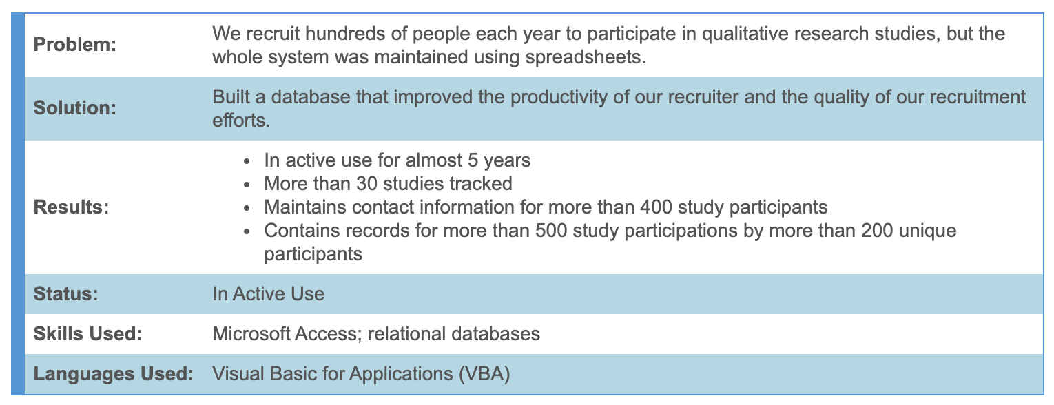
Example of a project summary
One project that stood out was a simple and fun app that he built to promote participant engagement at a Technology and Innovation fair. He used this project to give people an example of machine learning in action and demonstrate the capabilities of R and R Shiny.
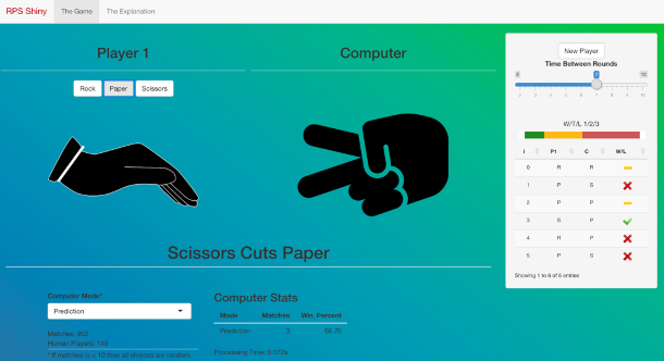
Image from Brandon’s “Rock, Paper, Scissors in R Shiny”
View Brandon's portfolio or LinkedIn.
Claudia ten Hoope
Claudia is a freelance data analyst and scientist with many years of experience in consulting and retail. Claudia’s portfolio has a consistently clear and structured approaching to showcasing her work detailing each case study by goal, result, and project duration. She then does a deep dive into each case, leveraging visuals to help her tell the story.
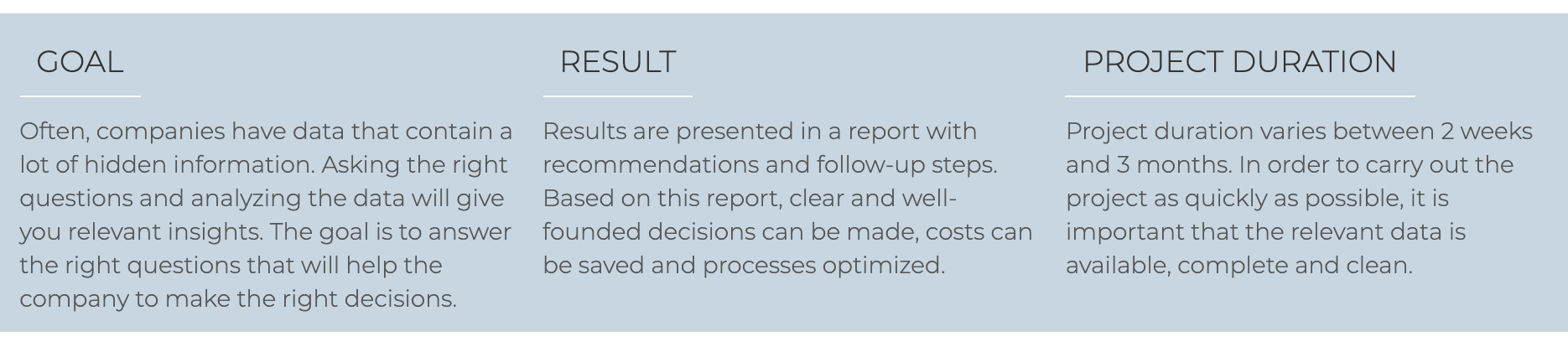
Example of a case study from Claudia’s portfolio
In one case study, Claudia uses visuals to help her customer understand how email purchases are more likely to lead to a purchase, pushing the client to create an email strategy for sales.
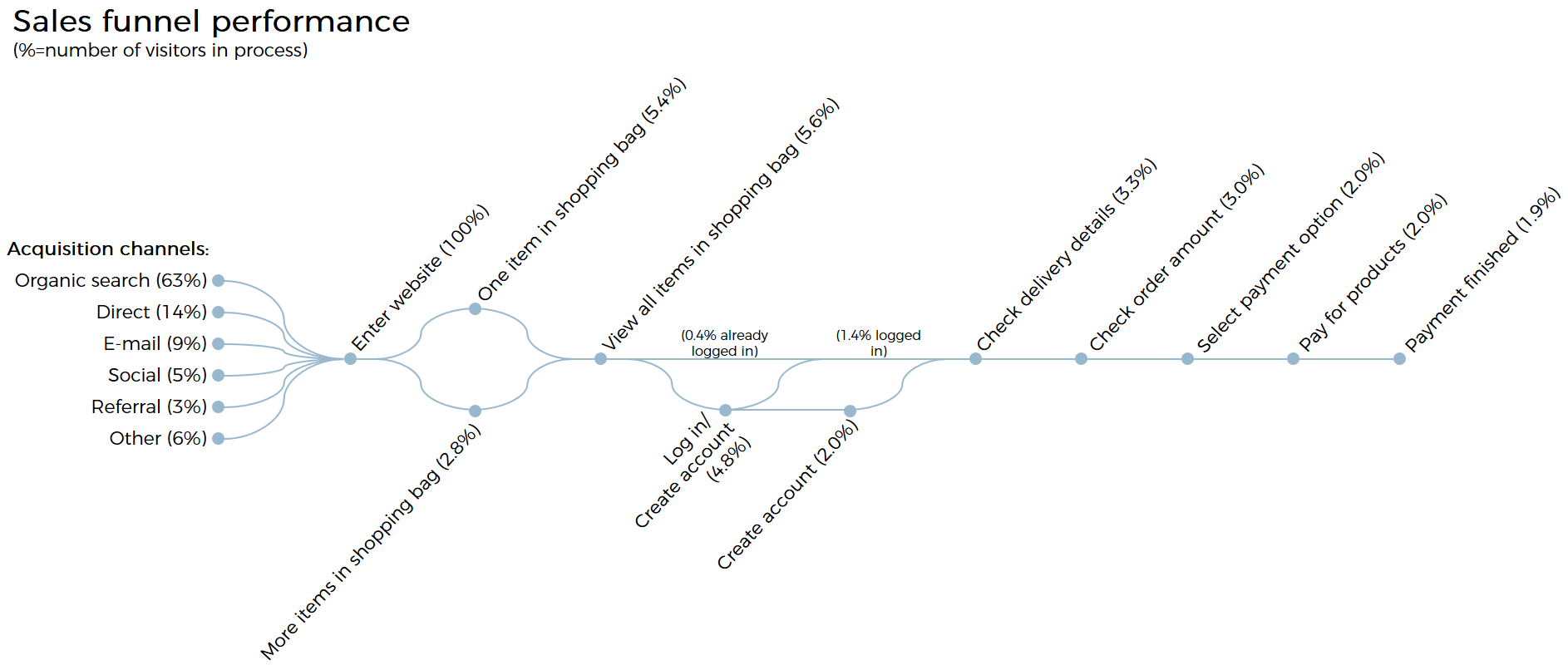
Example of a graph created for a case study
View Claudia's portfolio or LinkedIn.
Want to strategize your portfolio?
We're happy to strategize your portfolio and coordinate a feedback session! Please fill out the form below and we'll get back to you soon.