Data Portfolios from the Phase AI Community
By Andrea Yip on January 20, 2021

Data portfolios showcase the unique talents of a data professional. Unlike a typical resume, portfolios come in many different shapes and sizes, and demonstrates a person’s technical and non-technical thinking and results. Portfolios may include anything from thought pieces (i.e., blog posts, research papers) to the outputs of a data competition to end-to-end personal and workplace projects.
You may have read our previous article on the best data portfolios on the web. In the spirit of this article, we decided to feature a diversity of data portfolios from the Phase AI community. Our goal is not to evaluate or endorse these portfolios in any particular way. Rather, we hope that you find inspiration in the different approaches, topics, methods and communication styles represented in the examples below. We chose to highlight a project or feature about each portfolio that made them stand out.
Thanks to all those who submitted!
Richa Sethi (LinkedIn, Portfolio)
Richa developed a cardiovascular disease risk assessment screening tool to predict the risk of heart attack and stroke among adults using self-reported information. She explains how this type of tool can help transform the health industry by (1) providing new sources of insight to simplify and streamline current underwriting and (2) refining categorizations of risk.
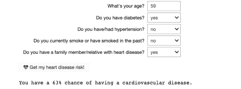
Tool assessing cardiovascular risk
Sidney Kung (LinkedIn, Portfolio)
Sidney has a Github page that showcases her projects and Medium articles. For instance, she has project that forecasts Los Angeles crime rates and another on Twitter hate speech detection. Through her projects, she walks through the business problem, data and methods, and model performance.
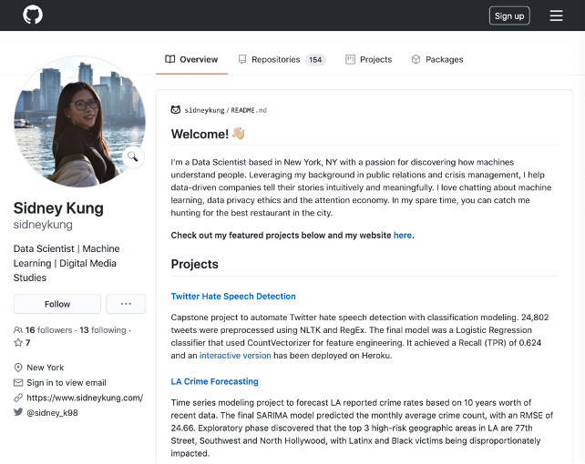
Sidney’s portfolio page on Github
Illya Kipnis (LinkedIn, Portfolio)
Illya writes about how he uses data analytics and data science for investment decisions on his blog. In his most recent post, he reviews a book about “Modern Asset Allocation for Wealth Management” by Dr. David Berns. He discusses how some of the ideas in the book, like an individual’s risk performance, can inform the way one shapes their financial portfolio.

Illya’s blog post
Ryan Sekulic (LinkedIn, Portfolio)
Ryan explores a hot topic today: online political conversation. He analyzes changes in polarization levels across two Canadian political discussion communities on Reddit. His analysis offers a few vantage points, from a broader perspective (aka the “sizzle” and the “steak”) to increasingly detailed and technical (aka the “recipe” or code files to the “ingredients” or underlying data).
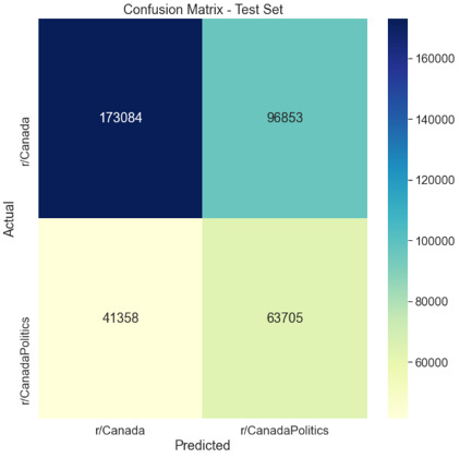
Confusion matrix recording correct and incorrect model predictions
Maxim Guzman (LinkedIn, Portfolio)
Maxim uses different metrics to compare the two McLaren drivers in the 2007 season: Fernando Alonso and Lewis Hamilton. He talks about the steps he goes through to clean and prepare the data and determines the better driver based on categories like grid positioning, lap-by-lap positioning, and points.
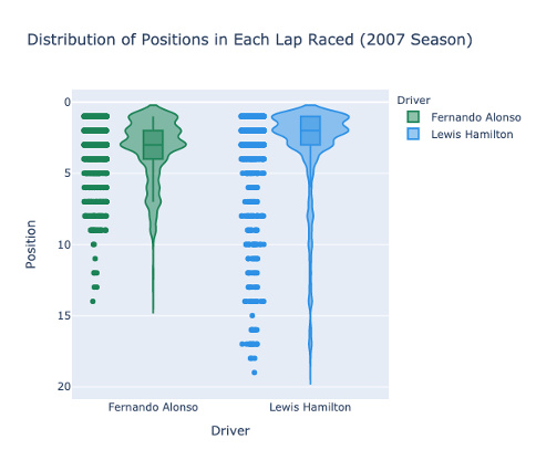
Lap-by-lap positioning
Irene Bratsis (LinkedIn, Portfolio)
Irene features a collection of projects on her personal site. One project examines how she built a model to predict the price of Ether, a cryptocurrency, based on ancillary data collected in her data set. In this case study, Irene explores Ether pricing data and performs discovery, exploration, cleaning and analysis, and arrives at a model. You can check out her Github as well.
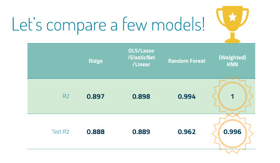
Model comparisons (Source: Presentation)
Samuel Stoltenberg (LinkedIn, Portfolio)
Samuel’s Github site hosts his projects and a blog where he offers tips and tricks to other data professionals. One of his projects is a “live graph” where the user can explore variables like price, total cash or free cash flow for a publicly traded company. The graph changes on demand and is an interesting way to get folks to interact with his work.
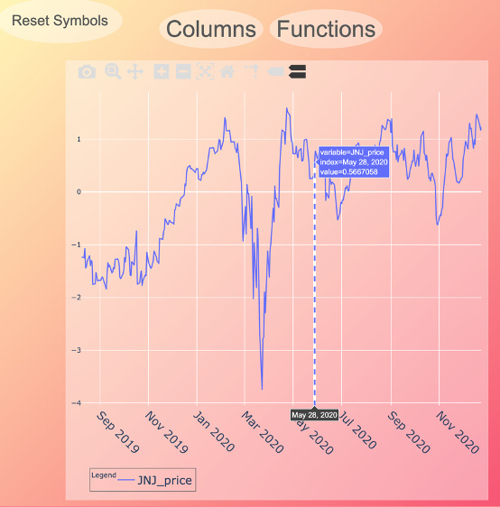
Live graph exploring the company “JNJ” (Source)
Harshil Patel (LinkedIn, Portfolio)
Harshil’s portfolio features an array of projects. In particular, Harshil uses video to help showcase some of his work, including an exploration into facial detection and recognition using OpenCV. This enables his audience to watch his work in action.
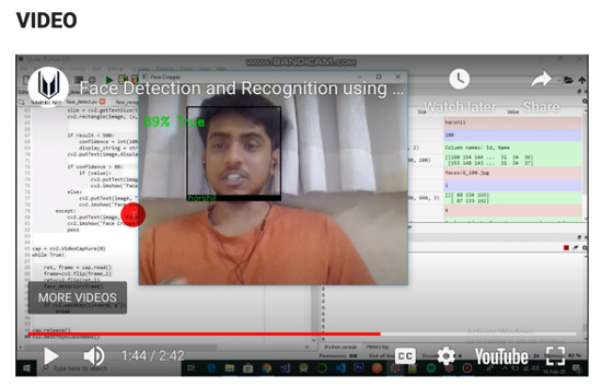
Video on face detection and recognition
Brian Beames (LinkedIn, Portfolio)
Brian provides a full overview of his skills, certifications and projects on Github. In particular he lists out Kaggle competitions he participated in, an experience that not all data professionals remember to include in their portfolios!
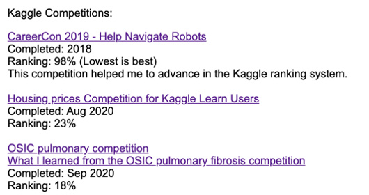
Snapshot of competitions listed in Brian’s portfolio